


Summary Overview
Common ecommerce homepage blocks work when they reduce orientation, product discovery, confidence, or re-engagement friction. They do not create conversion lift merely because many stores include them. This teardown explains the 11-pattern homepage anatomy from the supplied Shopify audit, shows where each pattern can help or fail, and gives operators a practical way to validate it with behavioral and commercial data. A high-converting ecommerce homepage is a product-discovery and confidence system, not a checklist of popular blocks.
Treat block frequency as a directional benchmark, not proof that a module causes conversion lift.
Make the first screen clarify the store, the proposition, and the most useful next action for a broad visitor group.
Design category paths, product discovery, trust information, and re-engagement as connected shopper journeys rather than isolated modules.
Measure each change by shopper behavior, revenue quality, mobile experience, and technical performance before declaring a winner.
A high-converting ecommerce homepage is a product-discovery and confidence system, not a checklist of popular blocks. The strongest pages make it easy to understand the store, find the right product path, trust the next action, and return later with consent. Every section should earn its place through a specific shopper job and a measurable outcome.
What the top-50 homepage graphic shows, and what it cannot prove
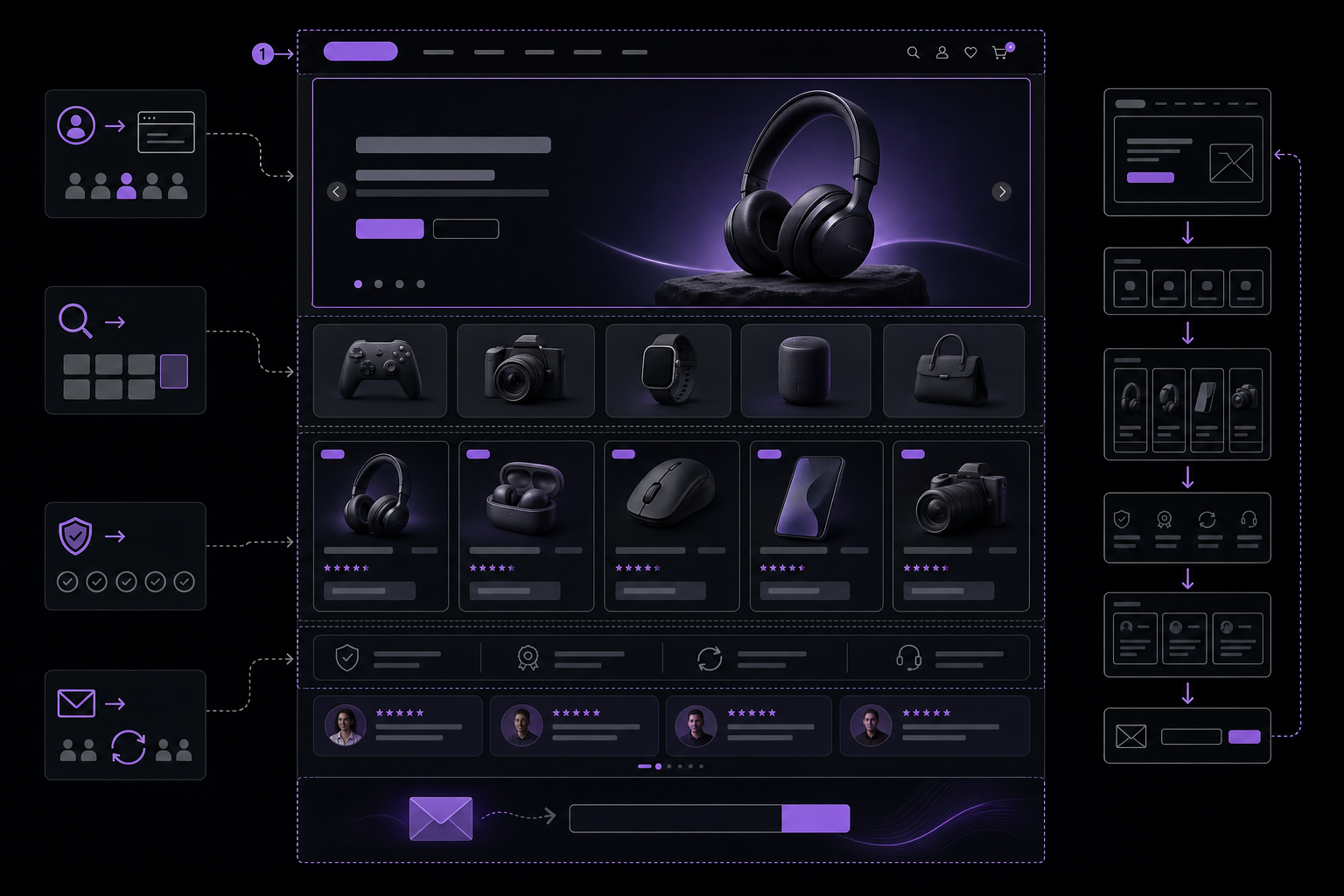
Help readers distinguish a visual sequence of homepage blocks from the customer jobs those blocks must perform to contribute value.
In a widely shared audit of top Shopify stores, Oliver Kenyon cataloged which homepage modules appear most often and distilled them into an 11-pattern anatomy. Treat that visual as a useful inventory of what many operators ship, not as proof that any given block drives lift. We will use it as a starting map, then judge each module by whether it reduces friction in one of four shopper jobs: orientation, product discovery, confidence, or re-engagement. See the original post for the directional pattern inventory: Oliver Kenyon.
Frequency is a heuristic, not a causal result
Common modules often reflect platform defaults, theme conventions, or merchandising habits. High-prevalence patterns can also be a survivorship artifact: teams keep what does not obviously break, even if it is neutral. Frequency tells you what many stores tried, not what your shoppers need. Use the audit to generate ideas, then test or validate with usability evidence. The goal is not to tick boxes on a Shopify homepage design checklist. The goal is to earn every pixel with a defined job to be done and a tractable success metric.
The four shopper jobs behind every homepage
We will evaluate each pattern by how well it serves one of four jobs:
Orientation: Help visitors understand what the store sells, for whom, and why it is different.
Product discovery: Give clear, low-effort routes into the right category, collection, or product.
Confidence: Reduce perceived risk with specific evidence, policies, and clear language.
Re-engagement: Earn permission to continue the conversation when purchase is not immediate.
This model keeps the teardown grounded in shopper problems, not in visual fashion.
Pattern 1: Announcement bar, header, and hero
Treat the top of the page as a single decision environment. The announcement bar sets timely context, the header is a routing system, and the hero clarifies proposition and next action. Together they should resolve the first questions a broad visitor group brings to the site.
Header: route shoppers to the right product family
The header is a product-finding tool. Clear, mutually exclusive, collectively exhaustive category labels beat clever phrasing. Put primary families first, reserve utility links for secondary menus, and offer prominent search for users who prefer direct entry. Baymard’s large body of homepage and category research emphasizes the importance of recognizable category names, visible paths to lists, and a search that is obvious and forgiving. Their findings are a strong reference point when mapping taxonomy and routing patterns from the homepage into collections and filters. See Baymard Institute.
On mobile, treat the header as a compact control center. Combine a short top bar with a clear logo target, a search icon that opens a full-screen input, and a menu that reveals primary categories first. Do not bury popular routes two taps deep. If your brand trades in replenishment goods or fast-moving items, consider exposing search inline on mobile to reduce the time to product.
Announcement bar: use it for value, not constant noise
The announcement bar should carry information that changes decisions: shipping thresholds, last-order-by dates, region-specific delivery windows, or policy clarifications that reduce uncertainty. Rotating slogans and permanent hype create banner blindness and cognitive noise. Phrase announcements in concrete terms, and back them with reachable policy pages. Place time-sensitive notes near actions they influence, such as placing delivery deadlines near a gift collection link or holiday category.
Announcements are also a place to demonstrate trust. If you cite certifications or regulated claims, ensure accuracy and provide a path to details that match what is promised. Clear disclosure and design quality are foundational signals of trustworthiness, as noted by the usability guidance from the Nielsen Norman Group.
Hero: clarify the category, promise, and next action
The first visual should answer three questions quickly: what category or proposition is this, who is it for, and what should I do next. A static hero with a single, prioritized call to action is often the safest default because it maximizes clarity and speed. If you use a carousel, apply strict constraints. Baymard’s carousel research shows that most engagement accrues to the first slide and that controls, alternatives, and mobile behavior determine whether subsequent frames are even seen. Consider placing alternative routes near the hero, provide clear controls, and avoid auto-rotation that can disrupt reading and reduce control on touch devices. See Baymard Institute’s carousel guidance.
Pattern 2: Category tiles and curated product discovery

Make the relationship among category tiles, search, curated product rows, and clear collection routes easy to understand.
Most visitors are not ready to buy from the homepage. They come to orient and to find a path. Category tiles, curated product rows, and campaign modules help browsers turn ambiguity into a useful browsing state. Each must connect clearly to the taxonomy and to a destination that does more work than the homepage can.
Category tiles: make the taxonomy visible
Category tiles are a simple way to show the store’s shape. Labels should mirror customer language, not internal jargon. If people search for “trail running shoes,” do not label the tile “Outdoor performance footwear.” Avoid novelty that makes shoppers decode. Baymard’s homepage and category navigation research supports the value of clear category naming and obvious starting points for product discovery. Ground tiles in that usability evidence and test labels with real queries and on-site search logs. See Baymard Institute.
Make the tiles do real routing work. Clicking a tile should land on a well-structured list or collection with filters, not a promo page with no facets. Use consistent photography that reads at small sizes and survives mobile cropping. For Shopify homepage design specifically, align tiles with your main collection handles and ensure the same taxonomy powers your navigation, search, and filters. Consistency lowers friction and aids recall on return visits.
Best sellers and new arrivals: offer a low-effort starting point
Best sellers and new arrivals can work as low-commitment entry points. They reduce choice overload by presenting a small, curated set. To earn space, define selection criteria. For best sellers, prefer items with strong stock coverage, high satisfaction, and clear options. For new arrivals, prefer items that express the season or a new technology that justifies attention. Avoid generic “trending” rows that echo the category page without adding meaning.
Validate curated rows by the behaviors they should influence: product detail page views, filter engagement after clickthrough, add-to-cart initiation, and scroll depth on the destination page. If the row pulls attention away from a higher-yield category route or if it introduces option anxiety, reduce it or move it lower.
Campaign banners: create a relevant route, not a dead-end promotion
Campaign modules often fail because they shout value without building a path. Make each banner serve an audience and a task. For example, a “Back to school kits” banner should lead to a pre-filtered category with bundles and a clear checklist, not a general products feed. Include truthful urgency, such as shipping cutoff dates, and avoid duplicating the same destination through several competing modules. Each route should feel like a distinct promise with a distinct landing experience.
Pattern 3: Second carousels, category grids, and image-with-text modules
Lower on the page, modules can either add depth or create repetition that slows decision-making. Require a distinct shopper question for every additional block. If a block cannot articulate the friction it removes, cut it or repurpose it.
A second product row must answer a different shopping question
If the first row introduces best sellers, a second row should serve a different intent. Consider rows for bundles that simplify multi-item needs, subscriptions for replenishment buyers, gifts for time-pressed shoppers, or seasonal sets that align with current context. Each row should be scoped tightly. “Staff picks” with no criteria read as filler. Use small but clear labels that set expectations, and send clicks to a landing experience that maintains the promise through filters or pre-sorted lists.
Image with text should resolve a decision barrier
Image-with-text blocks shine when they neutralize a known objection. Examples include explaining compatibility across models, clarifying material quality, or highlighting a differentiating feature that the category page cannot foreground. Keep copy short, factual, and linked to a destination where the claim can be validated, such as a collection filtered to compatible items or a PDP that demonstrates the feature in context. Avoid turning these into brand manifestos that slow people who are trying to shop.
Do not turn the homepage into a carousel graveyard
Carousels and sliders proliferate because they offer surface area. They also add interaction costs and hide content. If you must use them, give users explicit controls, avoid auto-advance, and ensure swiping does not conflict with page scroll on mobile. Provide alternative routes nearby for users who will not interact with controls. The practical constraints and risks are detailed in Baymard’s carousel research. Use that guidance to justify restraint, not to kill carousels outright. The standard is whether a module increases product discovery or removes doubt for your audience.
A smarter commerce system
Turn a better plan into real momentum.
DigiShop gives serious sellers a connected foundation for storefronts, acquisition, compliance, and performance so strategy can compound in the work.
Request early accessPattern 4: Social proof, policies, and email capture
Trust and consent are not decorations. They are risk reducers. Treat social proof as evidence, policies as clarity, and email capture as a voluntary re-engagement path with a clear value exchange.
Social proof must be specific, current, and proportionate
Logo strips, vague counts, and unverified quotes create a trust debt. Strong proof is specific and checkable: third-party certifications, dated awards, or reviews that mention concrete use cases. Place trust elements near the decision they influence, such as shipping promises near price displays or returns clarity near add-to-cart. The Nielsen Norman Group emphasizes design quality, accurate content, and clear disclosure as core trust signals. Use that lens to prune overclaiming and to align each proof point with a decision barrier.
Footer email capture is a re-engagement route, not a conversion substitute
Email capture is most honest when it sets expectations about frequency, content, and value. Offer reasons to subscribe that match shopper goals: first-access to back-in-stock items, fit guides for complex categories, or seasonal checklists. Gain consent without aggressive modals that block the first decision. Ethical disclosure, clarity, and perceived benefit are consistent with NNG’s trust guidance. Judge list growth by revenue quality over time, not just sign-ups. For example, track welcome-flow engagement, clickthrough to product routes, purchase latency, and refund context.
The performance layer that screenshots cannot show
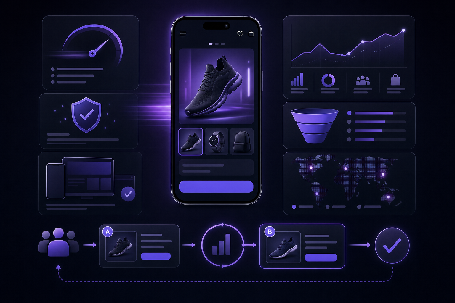
Visualize that homepage conversion work includes loading, interaction, visual stability, and measured experiments rather than visual changes alone.
Homepage design is also a performance system. Speed, layout stability, and input responsiveness are conversion levers because they shape the time to first useful action and the perceived effort of shopping. Google’s performance guidance ties faster, more stable experiences to better conversion outcomes and healthier funnel behavior. See Google web.dev on performance and conversion.
Measure the homepage as an experience, not a design review
Use Core Web Vitals as a shared language across design, engineering, and marketing. Largest Contentful Paint (LCP) captures how quickly the largest above-the-fold element renders. Cumulative Layout Shift (CLS) captures visual stability so buttons do not jump under a user’s finger. Interaction to Next Paint (INP) captures input responsiveness during real use. The current thresholds for a good experience are: LCP at or below 2.5 seconds, CLS at or below 0.1, and INP at or below 200 milliseconds. Ground the homepage discussion in these targets and relate them to time-to-action patterns like search initiation, collection clickthrough, and add-to-cart. See Google web.dev Core Web Vitals.
Make mobile a first-class teardown criterion
Most homepages are consumed on mobile. Audit priority content order, touch target sizes, and gesture conflicts. Crop images for small viewports so the subject remains legible. Defer or remove scripts that do not influence the first decision. Keep fonts lean and cacheable. For Shopify and other platforms, audit common app widgets that can bloat interaction cost. The aim is to reduce the time to product and to keep layout still while the user is deciding.
Resource hygiene checklist
Deliver a light, responsive hero image with appropriately sized sources and modern formats.
Inline only critical CSS for above-the-fold layout, load the rest asynchronously.
Delay nonessential scripts until after the first interaction path is visible.
Use system fonts or a minimal set of web fonts with font-display swap and preconnect.
Audit third-party widgets for input delay, especially review and chat components.
A homepage teardown scorecard and experimentation plan
Turn this research into a repeatable operating rhythm. Score every homepage module by the shopper job it solves, the audience it targets, the action it drives, the confidence it provides, the performance cost it adds, and whether it duplicates a route already available above. Then ship changes behind a hypothesis and measure with behavioral and commercial signals, segmented by device and traffic source.
The hypothesis template
Use this template to write crisp, testable changes:
Audience: who is this for, new vs returning, mobile vs desktop, channel context.
Module change: the specific element and what you will add, remove, or rewrite.
Friction removed: the decision barrier or step count this change reduces.
Expected behavior: the next action you expect to increase.
Primary metric: a single behavioral metric tied to the module’s job.
Guardrail metrics: Core Web Vitals, error rates, refund context, and high-level revenue quality.
Example: For new, mobile visitors from social, replacing a rotating hero with a static image and a single CTA will reduce orientation friction, increase clicks into the top category, and improve LCP by removing auto-advance scripts. Primary metric: clicks to top-category collection. Guardrails: LCP, CLS, INP, add-to-cart rate for that category, and bounce rate.
The measurement plan
Instrumentation should reflect the homepage’s jobs and routes. Track:
Category selection: clicks from category tiles or header to top-level collections.
Product interaction: product card clicks, quick views, and PDP entry from curated rows.
Search use: search initiations and result clicks, with zero-result rate and follow-on filters.
Campaign clicks: banner interactions and destination engagement, with exit rates from landing pages.
Add to cart: from the first collection page after a homepage route, segmented by route type.
Checkout start: initiation after homepage-driven sessions to gauge funnel handoff quality.
Email subscription: sign-ups by position and offer type, with welcome-flow engagement and purchase latency.
Revenue per session: compare by first route taken to understand which modules send higher-quality traffic.
Refund and return context: attach reasons to learn whether a route attracts mismatched buyers.
When traffic allows, run controlled experiments with fixed test windows and pre-registered hypotheses. When volume is limited, use qualitative evidence: session replays of first interactions, moderated usability passes that probe category understanding and trust, and structured customer interviews that surface naming mismatches or policy confusion. Tie every insight back to the four shopper jobs to avoid chasing visual fashion.
A practical scorecard you can copy
Score 0 to 3 for each criterion, then total and compare across modules. Replace, refine, or demote modules with low composite scores.
Shopper job clarity: does the module explicitly serve orientation, discovery, confidence, or re-engagement.
Audience fit: is the target segment clear and observable in analytics.
Primary action: is there one obvious next step that the module privileges.
Evidence: does the module include or link to specific proof or explanatory content where needed.
Performance cost: image weight, script cost, layout stability implications.
Duplicate route: subtract points if the destination is redundantly offered above without added context.
Example scoring snippet: “Static hero with single CTA to Women’s Trail Shoes.” Job: orientation and discovery. Audience: new visitors. Action: visit category. Evidence: brief differentiator line, shipping cutoff in announcement bar. Performance: lightweight responsive image, no slider script. Duplicate route: unique compared to header labels. This level of specificity lets teams debate trade-offs calmly and repeatably.
Frequently Asked Questions
What makes an ecommerce homepage high converting?
High-converting homepages help shoppers orient, discover, and gain confidence quickly, then offer a respectful way to re-engage if they are not ready to buy. The header routes to clear categories, the hero clarifies proposition and next action, and curated modules create relevant paths into collections or products. Trust elements are specific and placed near decisions. Performance is strong, with fast LCP, low CLS, and responsive INP as defined by Core Web Vitals, and the experience moves visitors to a useful next step with minimal friction.
Should an ecommerce homepage use a carousel?
Only if it solves a real problem and respects usability constraints. Many users never see past the first slide, and auto-rotation can hurt control and reading flow, especially on mobile. If you keep a carousel, include explicit controls, avoid auto-advance, provide alternative static routes nearby, and ensure touch interactions do not conflict with scrolling. These risks and mitigations are documented in Baymard’s carousel research.
How many sections should an ecommerce homepage have?
As few as needed to deliver the four shopper jobs without duplication. A strong pattern often includes a top system (announcement, header, hero), visible category routes, one or two curated discovery rows, targeted education that resolves a known barrier, and specific trust or re-engagement elements. Cut or demote anything that does not remove friction, slow users, or duplicate a route already offered above. Measure changes with behavior and performance, not by counting blocks.
Bringing it together
The cleanest Shopify homepage design is not the one with the fewest modules. It is the one where every module earns its spot by removing friction in a specific shopper job and by sending higher-quality traffic into the funnel. Use the top-50 pattern inventory as a directional library, then validate with usability research, behavioral metrics, and Core Web Vitals. If you defend each section with a clear job, a measurable outcome, and a performance budget, your homepage stops being a gallery of blocks and becomes a durable system for product discovery and confidence.